MONT 106N -- Identifying Patterns Seminar
Regression for exploratory data analysis
November 9, 2009
We want to work through an example illustrating one way
that regression is often used to try to identify a functional
relation between x and y.
| > |
 |
How the data was generated
| > |
 |
| > |
 |
| > |
 |
| > |
 |
 |
(1) |
| > |
 |
| > |
 |
| > |
 |
| > |
![`assign`(residuals1, `<,>`(seq(`+`(Y[i], `-`(subs(x = X[i], RLine))), i = 1 .. 200))); -1](images/DataAnalysis_15.gif) |
| > |
 |
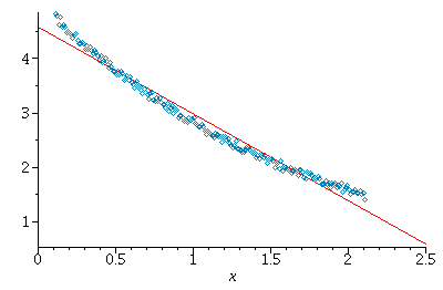
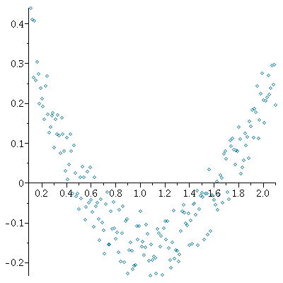
The residuals indicate that there is not a very good fit with a linear
model relation 
residuals look like they are tending to be positive, then negative,
then positive again on different ranges of x-values is a tip-off that
y probably does not depend linearly on y.
Let's see if things look different for some different functional forms.
What about a "power law" relation: 
had an exact relation of this form and we took logarithms of both
sides, then we would have 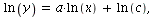 so the
points ( ) would lie on a straight line with slope
and intercept 
| > |
 |
 |
(2) |
| > |
![`assign`(lnX, `<,>`(seq(ln(X[i]), i = 1 .. 200))); -1](images/DataAnalysis_26.gif) |
| > |
![`assign`(lnY, `<,>`(seq(ln(Y[i]), i = 1 .. 200))); -1](images/DataAnalysis_27.gif) |
| > |
 |
| > |
 |
 |
(3) |
| > |
 |
| > |
 |
| > |
 |
 |
(4) |
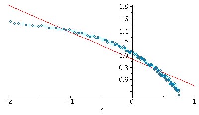
This residual plot also shows a pattern along the same lines as the previous one
(most residuals negative to the left, then positive in the middle, and
negative again to the right).
Hence this model relation  is probably not that good either. Next, let's try
a relation of the form  Taking logarithms again gives
| > |
 |
| > |
 |
 |
(5) |
| > |
 |
| > |
 |
| > |
 |
 |
(6) |
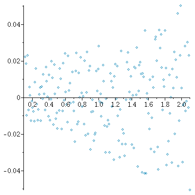
The following is more like what we want to see for the residuals -- a
cloud around the horizontal axis!
| > |
![`assign`(residuals3, `<,>`(seq(`+`(lnY[i], `-`(subs(x = X[i], RL3))), i = 1 .. 200))); -1](images/DataAnalysis_47.gif) |
| > |
 |
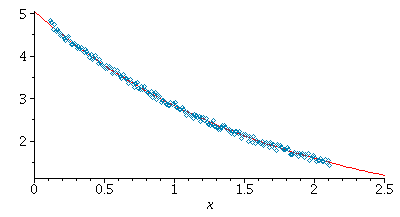
Finally, we plot the best fitting model relation with the original data
| > |
 |
| > |
 |